Medieval palaeography & writing
Medieval palaeography, the study of medieval handwriting, is a huge topic, so we are scratching the surface here.
We will also be scratching a few ... ahem ... possibly medieval-looking letter forms in order to gain a little understanding of the skill of a scribe!
ductus
Our first project task is to illustrate the ductus - the order and direction of strokes - of letters from different types/styles of writing.
I've chosen one letter - G - which has three different ductus (yes, the plural of ductus!) in three different scripts - Uncial; the Carolingian or Caroline minuscule; and Gothic.
Uncial
Uncial is a hybrid script of mostly capital, or majuscule, letters, a few minuscules - h, l, q, u, y - and four characteristically styled letters typical of this writing - a, d, e, m. It was most commonly used between the 4th and 8th centuries.
The manuscript below is in Latin, and dates from 7th-8th century:
The Parker Library, Corpus Christi College, Cambridge; MS 304:
Iuuencus, Euangelia metrica f. 45v
GGGGGGGGGGGGGGGGGGGGGGGGGGGGGGGGGGGGGGGGGGGGGGGGGGGGGGGGGGGGGGGGGGGGGGGGGG
Let's look at the ductus of the Uncial letter G:
GGGGGGGGGGGGGGGGGGGGGGGGGGGGGGGGGGGGGGGGGGGGGGGGGGGGGGGGGGGGGGGGGGGGGGGGGG
Now watch Patricia Lovett, a professional calligrapher, work an Uncial G - fantastic!
See Patricia Lovett's website to see examples of her work and calligraphy tips.
carolingian
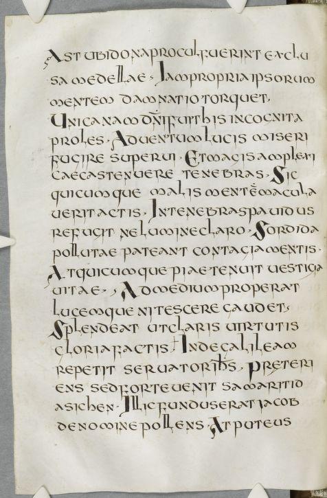
Carolingian minuscule spread across Western Europe from the 8th century, and what a beautifully legible script it is!
I found this wonderful example of a Carolingian script in Latin from the 10th century - The Trinity Gospels, written in Latin and produced in England:
The Trinity Gospels, Trinity College. Cambridge
Wanting to double check that this truly was Carolingian, I Googled The Trinity Gospels and discovered an article about this manuscript from the Trinity College, Cambridge blog - Anglo-Saxon Manuscripts in Trinity College Library: The Trinity Gospels - and learned that not only is this text Carolingian, but that it is "a particularly attractive Anglo-Caroline minuscule hand." I agree!
GGGGGGGGGGGGGGGGGGGGGGGGGGGGGGGGGGGGGGGGGGGGGGGGGGGGGGGGGGGGGGGGGGGGGGGGGG
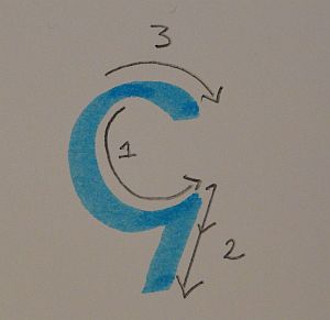
My attempt at illustrating the ductus of a Carolingian g - and every letter has its foibles. Difficulties here were starting in the right place for 1; finishing in the right place for 2; and getting the third tiny horizontal flick just in the right place, at the correct angle. There's a bit of a smudged join at the top, but it was great fun to try this one out:
GGGGGGGGGGGGGGGGGGGGGGGGGGGGGGGGGGGGGGGGGGGGGGGGGGGGGGGGGGGGGGGGGGGGGGGGGG
Find useful info about How to Write Caroline Minuscule from Dartmouth Ancient Books Lab.
gothic
The 12th century saw the appearance of Gothic script - or scripts, there being many variants. Things look squarer, more squashed together, more artistic maybe, more complex, almost more of everything - and much more difficult to read :)
Nevertheless, it's certainly impressive, and here's an excellent example in this manuscript from the 1340s - Rudolf von Ems' Chronicle of the World, written in Gothic Textualis for German:
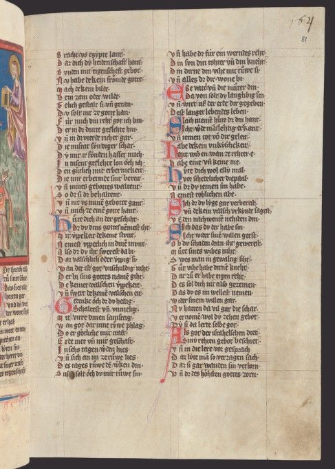
Zürich, Zentralbibliothek, Ms. Rh. 15, f. 81r – Rudolf von Ems, Weltchronik
(https://www.e-codices.ch/en/list/one/zbz/Ms-Rh-0015)
GGGGGGGGGGGGGGGGGGGGGGGGGGGGGGGGGGGGGGGGGGGGGGGGGGGGGGGGGGGGGGGGGGGGGGGGGG
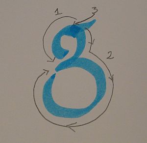
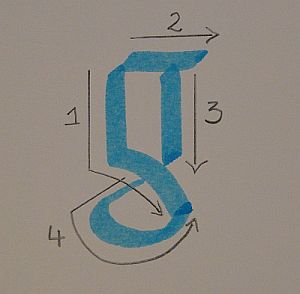
Ductus for a Gothic g - I can spot my errors in execution, but pretty pleased with this effort:
GGGGGGGGGGGGGGGGGGGGGGGGGGGGGGGGGGGGGGGGGGGGGGGGGGGGGGGGGGGGGGGGGGGGGGGGGG
The Gothic Calligraphy step-by-step tutorial by Katharine Scarfe Beckett was extremely helpful as I attempted to put together this jigsaw of a letter!
writing angle and weight
Now I'll compare the angles and weights of three lines of writing:
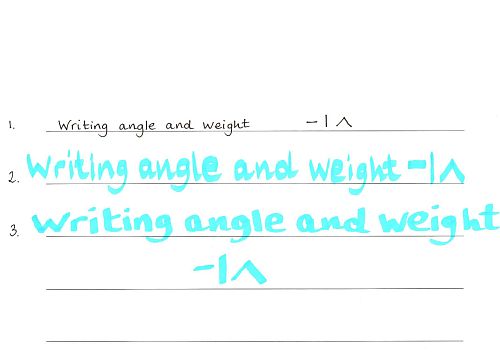
Line 1: The weight is light, there being no contrast between vertical, horizontal or oblique strokes when using my normal pen.
Line 2: With my marker, the weight is heavy, with good contrast between strokes. Horizontal strokes are the thickest, vertical the thinnest, and oblique strokes are the same as each other and medium.
The angle here is 90 degrees.
Line 3: Changing the angle to 45 degrees, heavy weight again, but the angle change makes for a slightly different morphology. This time, the thinnest stroke is oblique bottom left to top right; the thickest is oblique top left to bottom right. The horizontal and vertical strokes are somewhere in between.
text for next part of project
In the next part of my course, I'll be copying some text into my quires and thinking about some decoration.
I've decided to copy poems from The Book of Hortus, part of my novel called The Mazer (soon to be published on Smashwords.)
So here's the first poem of Hortus for you:
Silva your name, but gold you are at heart,
Graceful and wise, yet silent night and day.
If you could write, what would your wise words say?
If you could read, this skill, this vital art
Of joining letters, words and minds would chart
A course unto an island far away,
Where bark and leaf of tree their words display
In silent speech.
Thanks for reading, and see you next time!
- Home
- Make a Codex
- Palaeography & Writing Project